
What a Brand Identity Includes, and Why a Logo Alone Falls Short
A brand identity is the full system that makes your business recognizable: a logo suite, a color palette, typography, imagery and icon style, a written voice, templates and the guidelines that hold it together. The logo is one part of it. On its own, it tells nobody what your website, proposals or social posts should look like.
A brand identity is the complete system a business uses to look and sound like itself everywhere: a logo suite, a color palette, typography, photography and illustration direction, icons and graphic elements, a written voice, templates for the things you actually send, and guidelines that explain the rules. The logo is one piece of that system. It signs the work. It can't tell anyone what the work should look like.
The practical answer to "logo or full identity" is this. Buy only a logo when you have very few places to put it and nobody else will be designing with it. Once a website, a social feed, a sales deck or a second person making materials enters the picture, a lone logo leaves everyone guessing, and guessing is how brands drift.
Brand, brand identity and logo: three different jobs
People use these words interchangeably, which is where bad briefs start. They describe different things, and you buy them differently.
- Brand. What people think and feel about your business. Every interaction builds it: the work, the price, the phone manner, the reviews. You can't buy a brand from a designer. You earn it, and an identity helps people remember it.
- Brand identity. The designed toolkit that expresses the brand: the logo suite, color, type, imagery, icons, voice and the rules for using them. This is the part you commission, and the part you control completely.
- Logo. The mark that signs everything. A good one stays legible from the side of a building down to a browser tab. It identifies you, and that is all it does.
The difference matters because the logo is rarely where a business looks inconsistent. The trouble sits around it, in the two shades of blue on the website and the van, or the stock photos that could belong to anyone. An identity closes those gaps, which is why we treat the logo as page one of the system. If your materials already look like they came from different companies, our post on signs your business has outgrown its brand covers how to tell a refresh from a rebuild.
Cover the logo with your thumb. If people can still tell the post is yours, you have a brand identity.
What a complete brand identity system includes
Logo suite
One logo never fits every space. A proper suite includes a primary logo, a secondary version (usually horizontal or stacked) for wide headers and narrow columns, a standalone mark or icon for tight spaces, and one-color versions in black and reversed white for embroidery, stamps and dark photos. Good logo work gets tested at both extremes, the shopfront sign and the browser tab, before anyone signs it off.
The small sizes need their own files. Google asks for a square favicon of at least 8x8 pixels and recommends going larger than 48x48 pixels. Apple's app icon guidelines use a 1024x1024 pixel canvas for iOS, iPadOS and macOS, with default, dark, clear and tinted appearances, and advise including text only when it is essential to the brand. Google Play wants a 512x512 pixel, 32-bit PNG in sRGB. A long wordmark squeezed into a square rarely survives those sizes, so the icon needs design work of its own.
Color palette
A palette is a short list of colors with jobs: one or two primaries that carry recognition, a few supporting colors, neutrals for text and backgrounds, and functional colors for alerts if you run a website or app. Each color should be specified four ways: HEX for the web, RGB for screens, CMYK for print, and a Pantone reference for spot-color printing on signs and packaging, where the color has to match exactly.
Then it gets tested for accessibility. The W3C's contrast rule, WCAG success criterion 1.4.3, asks for a contrast ratio of at least 4.5:1 for normal text and 3:1 for large text (18 point, or 14 point bold). Text inside a logo is exempt. Your website's body copy and button labels are not. Ask for a list of approved text and background pairs with their ratios, so nobody finds out halfway through a website build that the signature color fails as a button.
Typography
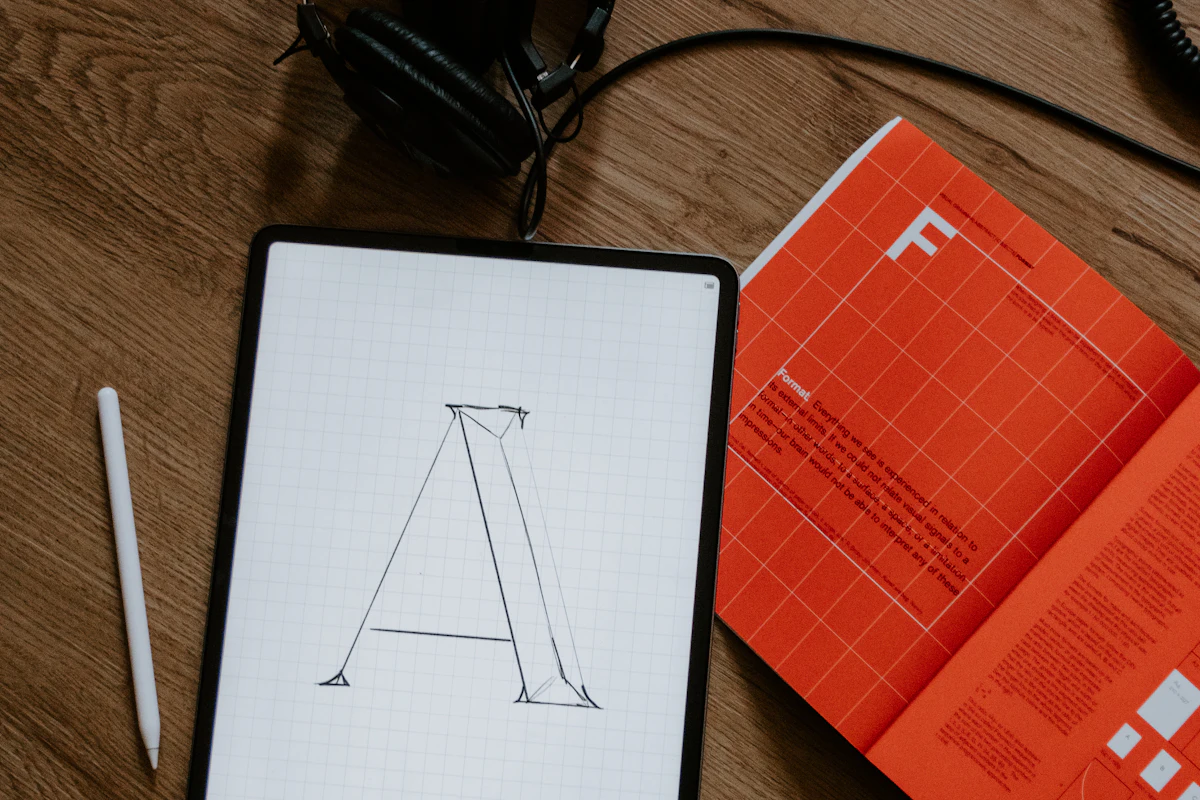
Most identities need two typefaces at most: one with character for headlines and one that reads comfortably in long text, plus set sizes and weights for headings, body copy, captions and buttons. Pick faces that hold up in every language you sell in and on a small phone screen.
Then check the license. Logo-only projects skip this step more than any other. A font's license decides where you may use it, and the uses are often sold separately. The licensing terms at the Fontfabric foundry are typical: a desktop license covers design and print work but rules out embedding the font on a website or server, web licenses are priced by monthly pageviews, and app licenses by downloads. Fonts under the SIL Open Font License work differently. The OFL FAQ confirms you can use them in logos and bundle them in commercial software, mobile apps included, as long as the license text goes with them. Ask your designer to list each font, its license and who holds it.
Imagery and photography direction
Photography direction is a brief for every image the brand uses: subjects, lighting, color treatment, cropping, and what to avoid. It means a hired photographer, or whoever picks stock images next year, produces pictures that look like they came from the same company. When we built the identity for NextGen Mechanics, an auto repair shop, photography direction shipped alongside the logo construction, the brand system and the business card. Most drivers can't judge mechanical skill, so honest workshop photos carry a lot of the trust.
Iconography and graphic elements
Icons, patterns, shapes and an illustration style are the supporting cast. They make a slide or a social post recognizable even when the logo is nowhere on it. A good icon set shares one stroke weight and one grid, and it arrives as SVG files so it stays sharp on screen.
Voice and tone
Voice is how the brand sounds in writing: the words it uses, the words it avoids, how formal it gets, whether it ever jokes. Customers read your sentences far more often than they study your logo, so voice belongs in the identity. A Nielsen Norman Group study on tone of voice found that casual, conversational and moderately enthusiastic tones performed best, and that perceived trustworthiness explained 52% of the variability in how desirable people found an organization. Useful voice guidelines give your team a few principles and before-and-after rewrites to copy. For Beyond Cleaners, rewriting the copy around customers' concerns instead of the company's history was as much a part of the rebrand as the visuals.
Applications and templates
Applications are the identity at work on the things you use every week: business cards, email signatures, proposals, invoices, decks, social templates, signage, vehicle wraps, uniforms, packaging. You don't need all of them. You need the ones your customers actually see, as editable templates, so your team stops rebuilding them from scratch.
Brand guidelines
Guidelines are the manual: clear space around the logo, minimum sizes, which version goes on which background, color values, type hierarchy, photo rules, voice principles and examples of misuse. Without them, the identity lives in the designer's head and leaves when the project ends. Our guide to brand guidelines covers what a usable one contains. In short, a lean guide people open beats a thick PDF nobody reads.
Brand identity deliverables, element by element
Use this as a checklist when you compare proposals. If a quote says "brand identity" but can't fill in the right-hand column, ask what is missing.
| Element | What it is | What you should receive |
|---|---|---|
| Logo suite | The primary logo plus versions for wide, narrow and tiny spaces | Primary, horizontal or stacked, icon, one-color black and reversed versions; favicon files; an app icon master (1024x1024 px for Apple) |
| Color palette | Primary, supporting, neutral and functional colors | HEX, RGB, CMYK and Pantone values; text and background pairs that meet WCAG contrast (4.5:1 for normal text) |
| Typography | Headline and text typefaces with a size hierarchy | Font names and weights, a type scale, fallback fonts, and confirmed desktop, web and app licenses |
| Imagery | Rules for photography and illustration | A photo direction brief with do and don't examples |
| Iconography and graphics | Icons, patterns and shapes that extend the look | An SVG icon set on a shared grid, plus pattern and graphic files |
| Voice and tone | How the brand writes | Voice principles, words to use and avoid, and before-and-after rewrites |
| Applications | The identity applied to real items | Editable templates for business cards, email signatures, decks and social posts, plus signage or packaging where needed |
| Brand guidelines | The rulebook that ties it together | A PDF or web guide covering clear space, minimum sizes, color, type, imagery, voice and misuse |
| Source files and rights | The masters and the paperwork | Editable source files, a font list, and a signed copyright transfer |
The files you should receive, and why
File formats sound like a footnote until a sign maker asks for "vector" and all you have is a JPEG from an old email. Ask for these, sorted into folders by use:
- SVG. The vector format for websites and apps. It scales to any size without blurring, and Apple's icon guidance makes the same case for vector graphics such as SVG or PDF.
- PDF and EPS. Print-ready vector files for printers, sign makers and embroiderers. PDF is the everyday choice, and some older print workflows still ask for EPS.
- PNG with a transparent background. For places that won't take vectors, like slides, email signatures and social profiles. Get light and dark versions.
- Separate RGB and CMYK files. RGB, usually with an sRGB color profile, is for screens. CMYK is for print. Mix them up and a logo that looks electric on a monitor comes out muddy on a flyer.
- Editable source files. The designer's working files, with fonts listed and logo text converted to outlines, so the files open correctly on a computer that doesn't have the font.
Then open every file on a computer that has never touched the project. If the logo renders and the fonts don't swap, the handover worked.
Who owns your logo: copyright and trademarks
Paying for a logo doesn't, by itself, make you its legal owner. Here is the plain version of the US rules. It is general information, not legal advice, and if your brand carries real value, a trademark attorney is worth the fee.
Copyright: get the transfer in writing
Under the US Copyright Act, copyright belongs initially to the author, the person who made the work, and a transfer of ownership is valid only if it is in writing and signed by the owner. The "work made for hire" route rarely rescues a logo. The Copyright Office's Circular 30 explains that a commissioned work counts as made for hire only if it falls into one of nine categories, such as part of an audiovisual work or a contribution to a collective work, and both parties sign a written agreement saying so. A standalone logo from an outside designer doesn't obviously fit any of them.
So the contract should say plainly that all rights in the final logo and identity files transfer to you on payment, and the designer should sign it. Ask about rejected concepts too, so the answer is written down instead of assumed. Fonts are the one part you never own outright: you hold a license to use them.
Trademark: protecting the name and the mark
Copyright protects the artwork. Trademark law is what stops a competitor from trading under a confusingly similar name or mark. The USPTO says a trademark can be any word, phrase, symbol or design that identifies your goods or services, and you become an owner as soon as you start using it. Those unregistered rights only reach the area where you trade, while federal registration gives you nationwide rights.
When you file, a standard character registration protects the wording itself in any font, style or color, while a special form registration protects only the specific logo you submitted. Each application covers one drawing. If your name does most of the recognition work, start with the standard character filing. The base application fee is $350 per class of goods or services, and more fees can apply. Search first: the USPTO lists similarity to an existing registered mark as one of the most common reasons applications are rejected, and that lesson is far cheaper before the signs are printed.
When a logo alone is enough, and when it isn't
A logo on its own is a sensible purchase in a few situations, and we'd rather say so than sell you a system you won't use.
- You are testing an idea. A side project or a pre-launch landing page needs a clean mark and a color or two. Spend the rest finding out whether anyone buys.
- You have very few touchpoints. A sole trader with a van, a business card and a directory listing can manage with a well-built logo suite and the color values written down.
- Your budget forces a sequence. Buy the logo suite now, built in vector with one-color versions and a favicon, and add the rest later. Avoid a cheap logo that has to be redrawn when the identity arrives.
A logo alone falls short once more than one person makes materials for the business, once you launch a website or app, once you sell to strangers who judge you before they ever speak to you, or once you want to charge more than the competitor down the road. From then on, every open question (which blue, which font, how formal, what kind of photo) gets answered differently by each person who touches it. Beyond Cleaners shows the pattern. It had the reputation offline, but people arriving cold met a site that didn't convey trust, and they left. The fix covered the whole presentation, from the messaging and testimonials to a simpler quote request, and it brought more customer requests and bookings.
How the process works and how long it takes
A typical identity project runs in four stages. Studios name them differently, but the order should hold.
- Discovery. Who you sell to, who you compete with, what you charge and where the business is heading, plus what customers already recognize in your current look.
- Directions. Two or three genuinely different concepts, each shown on real applications like a website header or a van, so you judge them in context instead of on a blank white page.
- Refinement. Focused rounds on the chosen direction: the full logo suite, palette and contrast checks, type and licensing, imagery and voice.
- Handover. Organized files, guidelines and templates, plus the signed transfer of rights.
For a small or mid-sized business, a focused identity usually takes four to eight weeks from kickoff to handover. A full rebrand with a new name, repositioning and a rollout across every touchpoint typically takes three to six months, and the rollout eats most of that time. Trademark registration runs on the USPTO's schedule, separate from the design work, so start the clearance search early.
Your next step: compare quotes on deliverables
Before you sign, hold each proposal up against this list:
- Does it name every logo version, including the icon, one-color versions, favicon and app icon?
- Are colors given in HEX, RGB, CMYK and Pantone, with tested contrast pairs?
- Are the fonts named, and is it clear who buys the desktop, web and app licenses?
- Will you get SVG, PDF or EPS, PNG and the editable source files?
- Does the contract include a signed copyright transfer on payment?
If every quote covers all five, you're comparing like with like, and the price gaps start to make sense. Our breakdown of what a logo and brand identity cost in 2026 covers the numbers. When you're ready, our brand identity work starts with the same discovery and ends with a system you fully own, source files included, at a fixed price agreed up front.
Good to know
Frequently asked questions
What is the difference between a logo and a brand identity?
A logo is the mark that identifies your business. A brand identity is the full system around it: logo versions, color palette, typography, imagery style, icons, voice and the guidelines for using them. The logo signs your materials, and the identity decides how everything else looks and sounds.
What should a brand identity package include?
At minimum, a logo suite with primary, secondary, icon and one-color versions, a color palette with HEX, RGB, CMYK and Pantone values, typography with confirmed licenses, and brand guidelines. Fuller packages add photography direction, an icon set, voice guidelines and editable templates for cards, decks, social posts and signage. You should also receive the source files and a signed copyright transfer.
What file formats should I get from my logo designer?
Ask for SVG for websites and apps, PDF or EPS for print, and PNG files with transparent backgrounds for slides, email and social profiles. Colors should come in separate RGB versions for screens and CMYK versions for print. You should also get the editable source files, a square favicon, and a 1024x1024 pixel app icon master if you have or plan an app.
Do I own the copyright to my logo if I paid a designer?
Not automatically under US law. Copyright starts with the person who created the work, and a transfer is only valid if it is in writing and signed by the owner. A logo from an outside designer rarely qualifies as a work made for hire, so make sure your contract includes a signed assignment of rights. This is general information, not legal advice.
Should I trademark my logo or my business name first?
If you can afford only one US filing, registering the name in standard characters usually gives the broadest protection. The USPTO explains that a standard character registration covers the wording in any font, style or color, while a logo registration covers only that specific design. Each version needs its own application, with a base fee of $350 per class of goods or services.
How long does it take to create a brand identity?
A focused brand identity for a small or mid-sized business typically takes four to eight weeks, from discovery through concepts, refinement and handover. A full rebrand that includes a new name and a rollout across every touchpoint usually takes three to six months. Trademark registration runs on its own separate timeline, so start the clearance search early.
Keep reading
Related articles
 Design & Branding
7 Signs Your Business Has Outgrown Its Brand
Your work got better. Your prices went up. Your brand stayed in 2019. Here are the seven signs it is now costing you money, and what to do about each one. Read article SEO & Performance
Local SEO in 2026: How to Get Into Google's Map Pack
The map pack is where local customers decide who to call. Here is how Google ranks it, what a finished Business Profile looks like, and a 30-day plan to earn your place. Read article Web Development
Website Redesign SEO: How to Relaunch Without Losing Rankings
Redesigns rarely lose traffic because of the new look. They lose it to missing redirects and staging settings that ship to the live site. Here is how to prevent both. Read articlePut this to work
Reading is free. So is asking. Tell us what you're building and we reply within one business day with honest next steps.